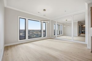
Choosing a paint color brings a lot of homeowners some anxiety. After all, your walls are a huge surface area, and you don’t want to make the wrong decision on what to do with them. Thankfully, this year’s trends offer plenty of options that will have enduring appeal long after 2018 has ended. From neutrals to rich colors, this lineup has it all. We’ve gathered some of our favorites together to share with you!
Keeping it Low-Key With Neutrals
As life gets more hectic, people are increasingly seeking to carve out a serene escape within their homes. If you want your home to be a retreat from sensory overload, 2018 has some great neutrals for you.
“Warm Buff” from Valspar
Valspar brought us 12 colors of the year this year. One of them was this beautiful brown-grey. “Gray is shifting warmer,” says Valspar color strategist Sue Kim, “and this one feels like a hug.” This color is all about coziness, so if you choose it, Valspar recommends keeping everything soothingly monochromatic. If you go that route, be sure to vary the texture to keep things interesting as well as cozy.
“Mink Grey” from Valspar
“This pretty, calming gray wraps you in a warm embrace with a touch of interesting but neutral violet,” says Kim. Which is intriguing, because, as we’ll get to in a moment, Pantone’s color of the year is a violet. So, if you like violet but prefer a subtle hint of it, this might be just the color for you! This one, again, is all about being calm and cozy.
“Charcoal Brown” from Valspar
We would probably recommend this one for an accent color. (But if you want to make a dramatic statement, go ahead and go for the whole room!) Regarding this rich, warm brown, Kim says, “Cool, dark and strong, this deep gray-brown is nearly black but radiates warmth when light is generous.” To bring out the full potential of this color, it would be best to use it in a room with plenty of natural light.
“Deep Onyx” from Glidden
We tend to forget, but black is a neutral, too. Although not as subtle as a more traditional neutral, it can still be used without overpowering the space. This particular black has a hint of warmth to it that’s really gorgeous. Don’t feel you have to commit to the entire space. Try it on one wall, or as a ceiling accent. PPG color marketing manager Misty Yeomans says, “Using a black paint color like Deep Onyx on your walls or in your decor might seem intimidating at first, but it’s actually one of the easiest colors to use to create the low-key, easygoing style that’s trending in 2018.”
Calming AND Dramatic: The Beautiful World of Blue!
Want to add some color to your walls without losing the serene atmosphere? Blue is a natural choice, and the paint companies have come through for us with a few gorgeous options.
“Oceanside” from Sherwin Williams
This is a deep, complex blue that almost acts as a neutral–in that its mood and character will completely change in line with its surroundings. We like it here as a dramatic entry door, but Sherwin Williams also has pictures of full rooms in this color, which are quite stunning.
“In the Moment” from Behr
This blue is almost green. It’s a very relaxed color that refreshes the eye. “This comfortable color evokes a sense of sanctuary and relaxation amid our busy, always-on lives,” Behr’s website explains. If you visit their site, you’ll see that this versatile color complements many different styles, and may be just the thing to make your home the calming retreat you dream of.
“Soft Teal” from Valspar
This color is contemporary with a hint of retro flair. Familiar enough to be comfortable, while interesting enough to add life to a space. Sue Kim says: “Nostalgic, versatile blue-green is both warm and cool, making it an easy companion to a range of other colors.” Valspar’s tips for this color include pairing it with lots of white and shiny silver accents. We’re thinking it could be a perfect accent in a bathroom.
Feeling Bolder?
We’ve saved these for last because they’re not for the faint of heart. However, don’t be deterred! Using a big statement color isn’t as scary as it might seem.
“Caliente” by Benjamin Moore
Pantone’s Color of the Year: Ultra Violet
Pantone’s color of the year is a blueish purple called Ultra Violet. This deep and mysterious shade is said to inspire creativity and reflection. If you’re looking for an intense dose of color and aren’t afraid to think outside the box, try an intense shade of purple in 2018!
We hope these colors will inspire you in your paint choices for 2018! If you need more inspiration, there are still 8 more Valspar colors of the year we didn’t even talk about here. For more inspiration, you can also click the links we included throughout the article to the official websites. They have tips on how to use the colors, and you can find coordinating colors as well. For more paint color inspiration, check out our Houzz account. Choosing a paint color is a great opportunity to inject some personality and life in your home. We hope you find the perfect shade to nail that mood you’re looking for!
Ready to get started building a beautiful home of your very own? Contact us at 509.737.6227 to schedule a meeting!


