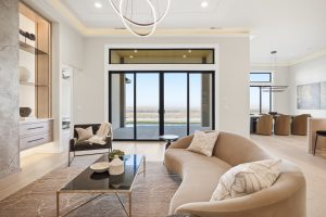
This week, we have a beautiful home to share with you! It features a river view, an awesome modern style, a sleek wet bar, and so much more! Located in Kennewick and overlooking the Columbia River, this home was modified from our Medley plan. It’s been a long time since we built a Medley, and this one turned out absolutely stunning! This home is a great example of what can be done to a standard floor plan to fit your specific needs and style. We’re very excited to show you around, so let’s begin!
A Striking First Impression
We start with the exterior, which sets a sophisticated tone from the start. We love the black trim and garage doors–a very sharp look. The little details, like the vertical garage door windows and the streamlined lighting fixtures, all contribute to a very cool modern exterior. One of the modifications to this home is its double doors, which create a dramatic entryway. For comparison, here’s our original Medley built a few years ago:
Now let’s take a look inside!
Great Room with a Great View!
The entryway, which features a stunning floor design, wainscoting, and a coffered ceiling, opens into the great room. This arrangement, with the kitchen to the left of the entry, was a great choice for the location of this home. You’ll see why in a minute. For now, take a look at that flooring: a beautiful grey-engineered hardwood, which presents a warm, cozy counterpoint to all the chrome, glass, and stainless steel.
Another modification made to the plan was to eliminate the dedicated dining room, which was originally located behind the kitchen.
This is still a great option for those who like a traditional dining room, but an increasing number of homeowners are opting out of this more compartmentalized style. Eliminating it created a larger, more defined entryway, and also added some extra space in the garage.
We love the look updated look of the kitchen, especially the switch to a larger, rectangular island. Light-colored granite is really popular right now, and for good reason. Against the rich, dark wood cabinetry, ice pearl granite is absolutely stunning. We love the way the black silgranite sink looks against it as well. You know how much we love a good contrast between the island and the perimeter around here! And this kitchen is a great example, with white cabinetry topped by black quartz along the perimeter. The subway tile backsplash is a classic but also very modern look, and also adds to that contrast with the black quartz.
Now let’s rotate around to what makes this layout so fantastic…
Check out that view! With the back of this lot overlooking the river, the Medley was a perfect choice. Like many of our plans, the entryway is oriented so that guests are looking straight toward the back wall when they walk in, which in this house, means they are looking straight through that virtually-full-glass wall in the back. Talk about an awesome first impression! But what’s really cool about the Medley is that the kitchen is also facing that direction. Imagine cooking with that view!
With a location this amazing, it would be a shame to close off any of that view with a solid wall. A 12-foot sliding glass door flanked by large windows takes full advantage of that beauty. The modern fireplace warms up the room while upping the cool factor, and its shape serves to balance that wide expanse of glass that it’s adjacent to. The chandelier marks the dining area, which, again, is integrated into the great room in this version of the Medley.
Little Room, Big Statement
Immediately notable about this powder room is that backsplash. If Pinterest is anything to go by, it seems everyone is obsessed with hex tile right now (and so are we)! Here, the metallic finish complements the geometric shape for a very modern look. On the floor, large format tiles add to the contemporary vibe. Against all of these dark colors, which include the black quartz countertop, white cabinetry was a great choice. In this picture, you can get a closer look at the cabinets in this home, which are Huntwood’s “Sonora” doors. This recessed style adds dimension to the space. Just stunning overall.
Life of the Party
Now we’re in the basement, but you would never know it unless we told you! Awash in natural light, it also has quite the view. At one end is one of our all-time favorite wet bars, and it really is the star of the show. Dark cabinets and lighting paired with light walls and floors makes for a balanced, stylish space. We love the mirror behind the bar because, not only does it look awesome, but it also makes the best of all of that gorgeous natural light.
Here we get a closer look. As you can see, there is space for more than one beverage fridge, as well as an abundance of storage. The glass shelving offers a place to show off bottles and glassware. At the far end of the counter, the backsplash is the same as in the powder room from upstairs. Complete with a sleek modern faucet and a sink, this space is ready for a party!
At the far end of the room, the modern tile, fireplace, and fan beautifully complement the look of the bar area. The result is a unified and aesthetically pleasing entertaining space that is versatile, stylish and adds so much value to the home!
There’s More to See!
This house has so much more to offer than what we’ve shown you today—including a beautiful master suite. Go check out the rest on our Houzz account. You can also see a video tour of the home here. If you want to know more about the Medley plan, which this home is a modified version of, click here to view the floor plan and read about the features it has to offer. If you love inspiring pictures of gorgeous homes, you should follow us on Pinterest, where we regularly share our projects with you.


